Ok, the style of this image below will take a bit of explaining, and I'm sure the measurement folks and graphic experts will tell you to never look at anything I share because it violates best practices ... but it doesn't matter what the graph looks like, it matters if the information is actionable. Right?
On the graph below, the "x-axis" is time ... from 12 months ago to today, in 10 day increments. The "y-axis" is the quality of a 12-month buyer, from low quality (0) to high quality (100). The colors represent the share of demand from items introduced in the past year.
What do you see?
Look at the bottom of the buyer file ... the bottom 25% for instance ... about 25% of what they purchase is new items.
Look at the top of the buyer file ... the top 15% for instance ... about 15% of what they purchase is new items.
You run this analysis for your business, right? You know whether new items are preferred by your best customers or by marginal buyers? Your merchandising strategy for prospecting and search and affiliates and comparison shopping engines depends upon your knowledge of this information.
Now look at what is happening in the past two months (months = -2, -1, 0). The share of demand coming from new items is declining, and it is declining across the board. Something changed.
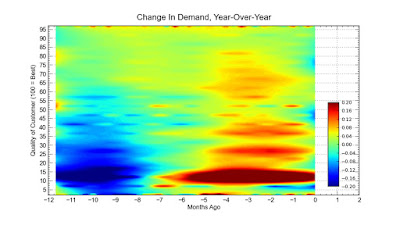
I ran this table - showing year-over-year change in demand from new items ... x/y axes are the same.
This is interesting. From four months ago to one month ago, customers (across the board) spent more on new items than a year prior - this reversed a lousy trend from 7 - 12 months ago. Clearly, the merchandising team put their foot on the new merchandise gas pedal, and customers liked what they saw, across the board!
But in the past month, year-over-year demand from new items stabilized. The gains are gone, and there is evidence that the top 80% of the twelve-month buyer file are spending less on new items.
For comparison purposes, let's look at the same trends for existing merchandise.
The top of the file exhibits mostly consistent trends on existing items during the past year.
The bottom of the file spent less on existing items 9-12 months ago ... then spent much more on existing items over the past six months, on average.
Let's add new and existing items together. What do we see?
This is a business that experienced tepid performance 9-12 months ago ... because the bottom of the file was struggling ... whereas the top of the customer file held firm. The bottom of the file likes new merchandise more than the top of the file ... and this was a timeframe when new merchandise struggled to perform well.
Between 1 and 4 months ago, the business experienced productivity gains across the board. This aligns with the improved productivity of new items during that timeframe.
And notice the strong signal among segments of marginal customers (10th to 15th percentile). When I see this, I usually observe a marketing tactic that was applied to a specific set of customer segments.
In this example, new items drove productivity gains across the board 1-4 months ago, and new items drove productivity declines among marginal customers 7-12 months ago. Existing item productivity was more consistent, especially across better customers. Existing customers tend to prefer existing items, marginal customers tend to prefer new items (in this case). This allows us to understand that any wobbly behavior in the business is due to inconsistency in new merchandise offerings.
The biggest challenge we have from 2016 - 2020 is to find new customers in a cost effective way. We'd prefer free tactics, too, right? Well, dig into your merchandise assortment. What do new/infrequent buyers like to purchase? Why not get that stuff out in front of those customers? Take advantage of what you control, stuff that doesn't cost you anything.


No comments:
Post a Comment
Note: Only a member of this blog may post a comment.