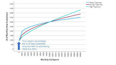
This image is going to provide the foundation for what I will talk about during the remainder of April (and possibly beyond). So yeah, it's an important image and you should click on it, print it, and post it in your virtual office or your corporate office. Here we go.
The three lines depict different curves observed in my project work. Sometimes (green) you can keep spending ad dollars and keep getting new customers. Sometimes (blue) you spend and get a lot of new customers, then the well runs dry.
The arrow represents the organic percentage ... the percentage of new customers you generate if you don't perform any advertising at all.
Tomorrow we'll start diving into some of the topics associated with this image. When we think about Category Development and how it relates to what is coming, we're thinking about ways to boost the trajectory from a Sharp Trajectory (not good) to a High Trajectory (good).


No comments:
Post a Comment
Note: Only a member of this blog may post a comment.