This company has a good relationship between in-category rebuy rates and future gross margin percentage within a category.
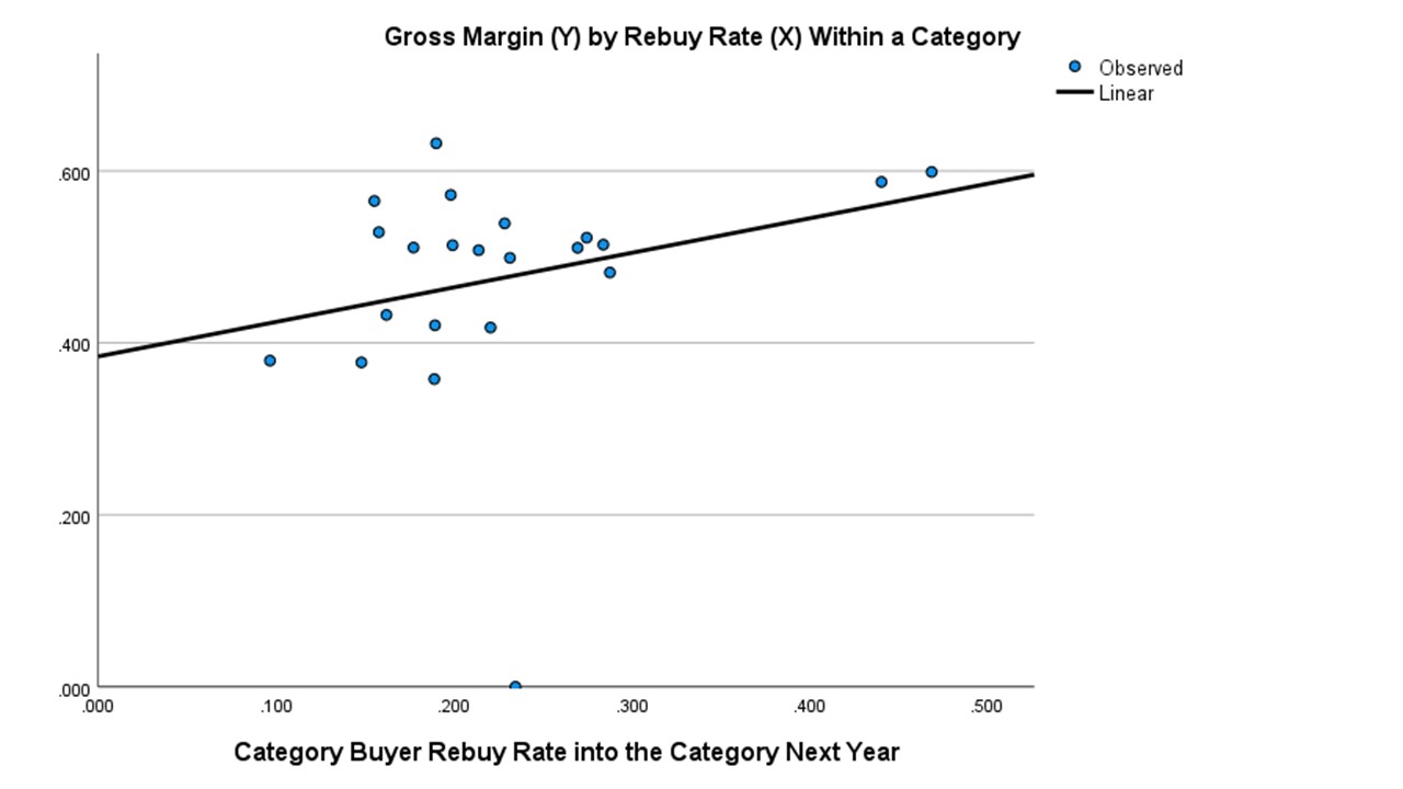
Ok, some categories have customers who are very likely to repurchase into that category next year ... for this company, those are rates above 35%. Similarly, other categories possess customers who are unlikely to repurchase into the category in the next year ... their rates are around 15% to 20%.
Here's the positive story told by the graph. Categories possessing customers who are likely to repurchase into the category next year have high gross margin percentages. Categories possessing customers who are unlikely to repurchase into the category next year have lower gross margin percentages.
If your graph has a "negative slope", then your customers are chewing through profit, sub-optimizing the brand.
Not this brand, however. High rebuy categories have high gross margins. Well done!
What does the data look like for your brand?

No comments:
Post a Comment
Note: Only a member of this blog may post a comment.